
By Investopedia Staff
on
March 24, 2013
The candlestick techniques we use today originated in the style of technical charting used by the Japanese for over 100 years before the West developed the bar and point-and-figure analysis systems. In the 1700s, a Japanese man named Homma, a trader in the futures market, discovered that, although there was a link between price and the supply and demand of rice, the markets were strongly influenced by the emotions of traders. He understood that when emotions played into the equation, a vast difference between the value and the price of rice occurred. This difference between the value and the price is as applicable to stocks today as it was to rice in Japan centuries ago. The principles established by Homma are the basis for the candlestick chart analysis, which is used to measure market emotions surrounding a stock.
This charting technique has become very popular among traders. One reason is that the charts reflect only short-term outlooks, sometimes lasting less than eight to 10 trading sessions. Candlestick charting is a very complex and sometimes difficult system to understand. Here we get things started by looking at what a candlestick pattern is and what it can tell you about a stock.
Candlestick Components
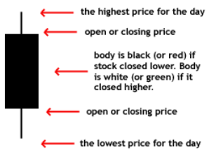
When first looking at a candlestick chart, the student of the more common bar charts may be confused; however, just like a bar chart, the daily candlestick line contains the market's open, high, low and close of a specific day. Now this is where the system takes on a whole new look: the candlestick has a wide part, which is called the "real body". This real body represents the range between the open and close of that day's trading. When the real body is filled in or black, it means the close was lower than the open. If the real body is empty, it means the opposite: the close was higher than the open.
Just above and below the real body are the "shadows". Chartists have always thought of these as the wicks of the candle, and it is the shadows that show the high and low prices of that day's trading. If the upper shadow on the filled-in body is short, it indicates that the open that day was closer to the high of the day. A short upper shadow on a white or unfilled body dictates that the close was near the high. The relationship between the day's open, high, low and close determines the look of the daily candlestick. Real bodies can be either long or short and either black or white. Shadows can also be either long or short.
Comparing Candlestick to Bar Charts
A big difference between the bar charts common in North America and the Japanese candlestick line is the relationship between opening and closing prices. We place more emphasis on the progression of today's closing price from yesterday's close. In Japan, chartists are more interested in the relationship between the closing price and the opening price of the same trading day.
In the two charts below we are showing the exact same daily charts of IBM to illustrate the difference between the bar chart and the candlestick chart. In both charts you can see the overall trend of the stock price; however, you can see how much easier looking at the change in body color of the candlestick chart is for interpreting the day-to-day sentiment.
Basic Candlestick Patterns
In the chart below of EBAY, you see the "long black body" or "long black line". The long black line represents a bearish period in the marketplace. During the trading session, the price of the stock was up and down in a wide range and it opened near the high and closed near the low of the day.
By representing a bullish period, the "long white body," or "long white line" (in the EBAY chart below, the white is actually gray because of the white background) is the exact opposite of the long black line. Prices were all over the map during the day, but the stock opened near the low of the day and closed near the high.
Spinning tops are very small bodies and can be either black or white. This pattern shows a very tight trading range between the open and the close, and it is considered somewhat neutral.
Doji lines illustrate periods in which the opening and closing prices for the period are very close or exactly the same. You will also notice that, when you start to look deep into candlestick patterns, the length of the shadows can vary.
The Bottom Line
The candlestick charting pattern is one that any experienced trader must know. As Japanese rice traders discovered centuries ago, investors' emotions surrounding the trading of an asset have a major impact on that asset's movement. Candlesticks help traders to gauge the emotions surrounding a stock, and thus make better predictions about where that stock might be headed.
Source: Investopedia
The candlestick techniques we use today originated in the style of technical charting used by the Japanese for over 100 years before the West developed the bar and point-and-figure analysis systems. In the 1700s, a Japanese man named Homma, a trader in the futures market, discovered that, although there was a link between price and the supply and demand of rice, the markets were strongly influenced by the emotions of traders. He understood that when emotions played into the equation, a vast difference between the value and the price of rice occurred. This difference between the value and the price is as applicable to stocks today as it was to rice in Japan centuries ago. The principles established by Homma are the basis for the candlestick chart analysis, which is used to measure market emotions surrounding a stock.
This charting technique has become very popular among traders. One reason is that the charts reflect only short-term outlooks, sometimes lasting less than eight to 10 trading sessions. Candlestick charting is a very complex and sometimes difficult system to understand. Here we get things started by looking at what a candlestick pattern is and what it can tell you about a stock.
Candlestick Components
When first looking at a candlestick chart, the student of the more common bar charts may be confused; however, just like a bar chart, the daily candlestick line contains the market's open, high, low and close of a specific day. Now this is where the system takes on a whole new look: the candlestick has a wide part, which is called the "real body". This real body represents the range between the open and close of that day's trading. When the real body is filled in or black, it means the close was lower than the open. If the real body is empty, it means the opposite: the close was higher than the open.
 |
| Figure 1: A candlestick |
Just above and below the real body are the "shadows". Chartists have always thought of these as the wicks of the candle, and it is the shadows that show the high and low prices of that day's trading. If the upper shadow on the filled-in body is short, it indicates that the open that day was closer to the high of the day. A short upper shadow on a white or unfilled body dictates that the close was near the high. The relationship between the day's open, high, low and close determines the look of the daily candlestick. Real bodies can be either long or short and either black or white. Shadows can also be either long or short.
Comparing Candlestick to Bar Charts
A big difference between the bar charts common in North America and the Japanese candlestick line is the relationship between opening and closing prices. We place more emphasis on the progression of today's closing price from yesterday's close. In Japan, chartists are more interested in the relationship between the closing price and the opening price of the same trading day.
In the two charts below we are showing the exact same daily charts of IBM to illustrate the difference between the bar chart and the candlestick chart. In both charts you can see the overall trend of the stock price; however, you can see how much easier looking at the change in body color of the candlestick chart is for interpreting the day-to-day sentiment.
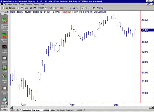 |
| Figure 2: Daily bar chart of IBM |
| Source: TradeStation |
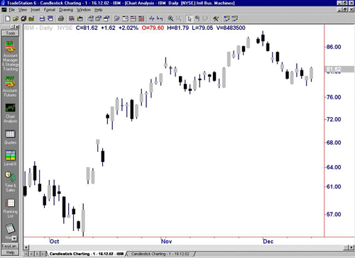 |
| Figure 3: Daily candlestick chart of IBM |
| Source: TradeStation |
Basic Candlestick Patterns
In the chart below of EBAY, you see the "long black body" or "long black line". The long black line represents a bearish period in the marketplace. During the trading session, the price of the stock was up and down in a wide range and it opened near the high and closed near the low of the day.
By representing a bullish period, the "long white body," or "long white line" (in the EBAY chart below, the white is actually gray because of the white background) is the exact opposite of the long black line. Prices were all over the map during the day, but the stock opened near the low of the day and closed near the high.
Spinning tops are very small bodies and can be either black or white. This pattern shows a very tight trading range between the open and the close, and it is considered somewhat neutral.
Doji lines illustrate periods in which the opening and closing prices for the period are very close or exactly the same. You will also notice that, when you start to look deep into candlestick patterns, the length of the shadows can vary.
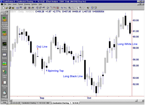 |
| Figure 4: Daily chart of EBAY showing Doji lines and spinning tops |
| Source: TradeStation |
The Bottom Line
The candlestick charting pattern is one that any experienced trader must know. As Japanese rice traders discovered centuries ago, investors' emotions surrounding the trading of an asset have a major impact on that asset's movement. Candlesticks help traders to gauge the emotions surrounding a stock, and thus make better predictions about where that stock might be headed.
Source: Investopedia
No comments:
Post a Comment