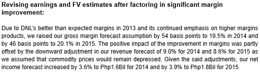
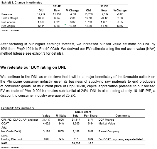
 |
| Source: Col Financial |
Philippines News: FREE
Get an edge on the Philippine Stock Market in this comprehensive tool for Filipinos and foreign investors.

Saturday, March 29, 2014
D&L Industries, Inc: Raising FV to Php10/sh on higher earnings growth potential

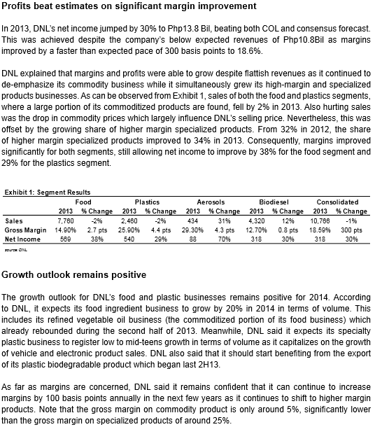

Source: Col Financial
Friday, March 28, 2014

Thursday, March 27, 2014


Wednesday, March 19, 2014
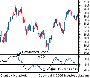
Moving Average Convergence Divergence - MACD
Definition of 'Moving Average Convergence Divergence - MACD'
A trend-following momentum indicator that shows the
relationship between two moving averages of prices. The MACD is
calculated by subtracting the 26-day exponential moving average (EMA)
from the 12-day EMA. A nine-day EMA of the MACD, called the "signal
line", is then plotted on top of the MACD, functioning as a trigger for
buy and sell signals.
 |
|
|
Candlestick Charting: What Is It?
By Investopedia Staff
on
March 24, 2013
The candlestick techniques we use today originated in the style of technical charting used by the Japanese for over 100 years before the West developed the bar and point-and-figure analysis systems. In the 1700s, a Japanese man named Homma, a trader in the futures market, discovered that, although there was a link between price and the supply and demand of rice, the markets were strongly influenced by the emotions of traders. He understood that when emotions played into the equation, a vast difference between the value and the price of rice occurred. This difference between the value and the price is as applicable to stocks today as it was to rice in Japan centuries ago. The principles established by Homma are the basis for the candlestick chart analysis, which is used to measure market emotions surrounding a stock.
This charting technique has become very popular among traders. One reason is that the charts reflect only short-term outlooks, sometimes lasting less than eight to 10 trading sessions. Candlestick charting is a very complex and sometimes difficult system to understand. Here we get things started by looking at what a candlestick pattern is and what it can tell you about a stock.
Candlestick Components
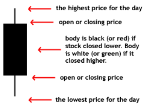
When first looking at a candlestick chart, the student of the more common bar charts may be confused; however, just like a bar chart, the daily candlestick line contains the market's open, high, low and close of a specific day. Now this is where the system takes on a whole new look: the candlestick has a wide part, which is called the "real body". This real body represents the range between the open and close of that day's trading. When the real body is filled in or black, it means the close was lower than the open. If the real body is empty, it means the opposite: the close was higher than the open.
Just above and below the real body are the "shadows". Chartists have always thought of these as the wicks of the candle, and it is the shadows that show the high and low prices of that day's trading. If the upper shadow on the filled-in body is short, it indicates that the open that day was closer to the high of the day. A short upper shadow on a white or unfilled body dictates that the close was near the high. The relationship between the day's open, high, low and close determines the look of the daily candlestick. Real bodies can be either long or short and either black or white. Shadows can also be either long or short.
Comparing Candlestick to Bar Charts
A big difference between the bar charts common in North America and the Japanese candlestick line is the relationship between opening and closing prices. We place more emphasis on the progression of today's closing price from yesterday's close. In Japan, chartists are more interested in the relationship between the closing price and the opening price of the same trading day.
In the two charts below we are showing the exact same daily charts of IBM to illustrate the difference between the bar chart and the candlestick chart. In both charts you can see the overall trend of the stock price; however, you can see how much easier looking at the change in body color of the candlestick chart is for interpreting the day-to-day sentiment.
Basic Candlestick Patterns
In the chart below of EBAY, you see the "long black body" or "long black line". The long black line represents a bearish period in the marketplace. During the trading session, the price of the stock was up and down in a wide range and it opened near the high and closed near the low of the day.
By representing a bullish period, the "long white body," or "long white line" (in the EBAY chart below, the white is actually gray because of the white background) is the exact opposite of the long black line. Prices were all over the map during the day, but the stock opened near the low of the day and closed near the high.
Spinning tops are very small bodies and can be either black or white. This pattern shows a very tight trading range between the open and the close, and it is considered somewhat neutral.
Doji lines illustrate periods in which the opening and closing prices for the period are very close or exactly the same. You will also notice that, when you start to look deep into candlestick patterns, the length of the shadows can vary.
The Bottom Line
The candlestick charting pattern is one that any experienced trader must know. As Japanese rice traders discovered centuries ago, investors' emotions surrounding the trading of an asset have a major impact on that asset's movement. Candlesticks help traders to gauge the emotions surrounding a stock, and thus make better predictions about where that stock might be headed.
Source: Investopedia
The candlestick techniques we use today originated in the style of technical charting used by the Japanese for over 100 years before the West developed the bar and point-and-figure analysis systems. In the 1700s, a Japanese man named Homma, a trader in the futures market, discovered that, although there was a link between price and the supply and demand of rice, the markets were strongly influenced by the emotions of traders. He understood that when emotions played into the equation, a vast difference between the value and the price of rice occurred. This difference between the value and the price is as applicable to stocks today as it was to rice in Japan centuries ago. The principles established by Homma are the basis for the candlestick chart analysis, which is used to measure market emotions surrounding a stock.
This charting technique has become very popular among traders. One reason is that the charts reflect only short-term outlooks, sometimes lasting less than eight to 10 trading sessions. Candlestick charting is a very complex and sometimes difficult system to understand. Here we get things started by looking at what a candlestick pattern is and what it can tell you about a stock.
Candlestick Components
When first looking at a candlestick chart, the student of the more common bar charts may be confused; however, just like a bar chart, the daily candlestick line contains the market's open, high, low and close of a specific day. Now this is where the system takes on a whole new look: the candlestick has a wide part, which is called the "real body". This real body represents the range between the open and close of that day's trading. When the real body is filled in or black, it means the close was lower than the open. If the real body is empty, it means the opposite: the close was higher than the open.
 |
| Figure 1: A candlestick |
Just above and below the real body are the "shadows". Chartists have always thought of these as the wicks of the candle, and it is the shadows that show the high and low prices of that day's trading. If the upper shadow on the filled-in body is short, it indicates that the open that day was closer to the high of the day. A short upper shadow on a white or unfilled body dictates that the close was near the high. The relationship between the day's open, high, low and close determines the look of the daily candlestick. Real bodies can be either long or short and either black or white. Shadows can also be either long or short.
Comparing Candlestick to Bar Charts
A big difference between the bar charts common in North America and the Japanese candlestick line is the relationship between opening and closing prices. We place more emphasis on the progression of today's closing price from yesterday's close. In Japan, chartists are more interested in the relationship between the closing price and the opening price of the same trading day.
In the two charts below we are showing the exact same daily charts of IBM to illustrate the difference between the bar chart and the candlestick chart. In both charts you can see the overall trend of the stock price; however, you can see how much easier looking at the change in body color of the candlestick chart is for interpreting the day-to-day sentiment.
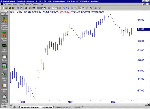 |
| Figure 2: Daily bar chart of IBM |
| Source: TradeStation |
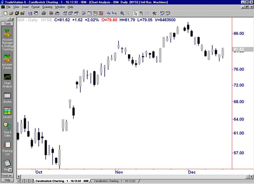 |
| Figure 3: Daily candlestick chart of IBM |
| Source: TradeStation |
Basic Candlestick Patterns
In the chart below of EBAY, you see the "long black body" or "long black line". The long black line represents a bearish period in the marketplace. During the trading session, the price of the stock was up and down in a wide range and it opened near the high and closed near the low of the day.
By representing a bullish period, the "long white body," or "long white line" (in the EBAY chart below, the white is actually gray because of the white background) is the exact opposite of the long black line. Prices were all over the map during the day, but the stock opened near the low of the day and closed near the high.
Spinning tops are very small bodies and can be either black or white. This pattern shows a very tight trading range between the open and the close, and it is considered somewhat neutral.
Doji lines illustrate periods in which the opening and closing prices for the period are very close or exactly the same. You will also notice that, when you start to look deep into candlestick patterns, the length of the shadows can vary.
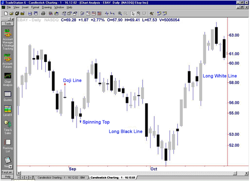 |
| Figure 4: Daily chart of EBAY showing Doji lines and spinning tops |
| Source: TradeStation |
The Bottom Line
The candlestick charting pattern is one that any experienced trader must know. As Japanese rice traders discovered centuries ago, investors' emotions surrounding the trading of an asset have a major impact on that asset's movement. Candlesticks help traders to gauge the emotions surrounding a stock, and thus make better predictions about where that stock might be headed.
Source: Investopedia
Monday, March 17, 2014
COL Model Portfolio
| As of: March 17, 2014 | * Source: Bloomberg | c Concensus Forecast |
| COL | COL | Buy | |||
| Ticker | Price | Rating | FV | Below | |
| BDO | 83.60 | BUY | 94.00 | 81.00 | |
| MBT | 80.90 | BUY | 100.00 | 86.00 | |
| EEI | 11.60 | BUY | 12.70 | 11.00 | |
| AC | 564.00 | BUY | 689.00 | 599.00 | |
| DNL | 8.24 | BUY | 9.10 | 7.90 | |
| TEL | 2,666.00 | BUY | 3,260.00 | 2,834.00 | |
| ALI | 28.40 | BUY | 36.08 | 31.00 | |
| MEG | 4.10 | BUY | 4.54 | 3.90 | |
| SMPH | 14.40 | BUY | 19.41 | 16.80 |
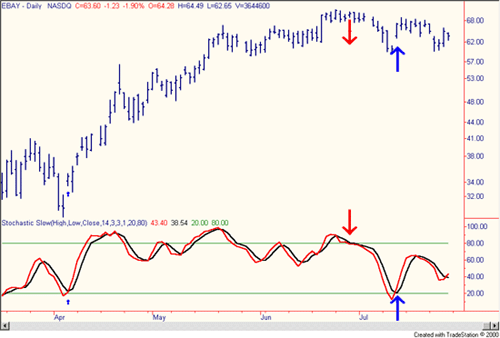
Stochastics: An Accurate Buy And Sell Indicator
George Lane developed stochastics,
an indicator that measures the relationship between an issue's closing
price and its price range over a predetermined period of time.
Fourteen is the mathematical number used in the time model, and it can, depending on the technician's goal, represent days, weeks or months. The chartist may want to examine an entire sector. For a long-term view of a sector, the chartist would start by looking at 14 months of the entire industry's trading range. (For more insight on chart reading, see Charting Your Way To Better Returns.)
Price Action
The premise of stochastics holds that a stock's closing price tends to trade at the high end of the day's price action. Price action is the prices at which a stock traded throughout the daily session. The stock may have opened at $10.00, traded as low as $9.75 and as high as $10.75, and closed at $10.50 for the day. The price action of this example is between $9.75 (the low of the day) and $10.75 (the high of the day). If the issue, however, is currently in a downtrend cycle, the closing prices will tend to close at or near the low of the trading session.
Jack D. Schwager, the CEO of Wizard Trading and author of some the best books written on technical analysis, uses the term "normalized" to describe stochastic oscillators that have predetermined boundaries both on the high and low sides. An example of such an oscillator is the relative strength index (RSI) which has a range of 0-100, and are set at either the 20-80 range or the 30-70 range. Whether your looking at a sector or an individual issue, it can be very beneficial to use stochastics and the RSI in conjunction with each other. (For more, see Ride The RSI Rollercoaster and Exploring Oscillators and Indicators: RSI.)
Formula
Stochastics is measured with the %K line and the %D line, and it is the %D line that we follow closely, for it will indicate any major signals in the chart. Mathematically, the %K line looks like this:
C = the most recent closing price
L5 = the low of the five previous trading sessions
H5 = the highest price traded during the same 5 day period.
The formula for the more important %D line looks like this:
We show you these formulas for interest's sake only. Today's charting software does all the calculations, making the whole technical analysis process so much easier and thus more exciting for the average investor. For the purpose of realizing when a stock has moved into an overbought or oversold position, stochastics is the favored technical indicator as it is easy to perceive and has a high degree of accuracy.
Reading the Chart
The K line is the fastest and the D line is the slower of the two lines. The investor needs to watch as the D line and the price of the issue begin to change and move into either the overbought (over the 80 line) or the oversold (under the 20 line) positions. The investor needs to consider selling the stock when the indicator moves above the 80 level. Conversely, the investor needs to consider buying an issue that is below the 20 line and is starting to move up with increased volume.
Over the years many have written articles exploring the "tweaking" of this indicator, but new investors should concentrate on the basics of stochastics.
In the above chart of eBay, a number of clear buying opportunities presented themselves over the spring and summer months of 2001. There are also a number of sell indicators that would have drawn the attention of short-term traders. The strong buy signal in early April would have given both investors and traders a great 12-day run, ranging from the mid $30.00 area to the mid $50.00 area. The current run in the stock started with a strong buy signal just two weeks ago. Although the buy signal appears to have been a false start, it has confirmed that, even in these tough market conditions for the Internet stocks, more new money is coming into eBay.
Conclusion
Stochastics is a favorite indicator of some technicians because of the accuracy of its findings. It is easily perceived both by seasoned veterans and new technicians, and it tends to help all investors make good entry and exit decisions on their holdings.
Source: Investopedia
Fourteen is the mathematical number used in the time model, and it can, depending on the technician's goal, represent days, weeks or months. The chartist may want to examine an entire sector. For a long-term view of a sector, the chartist would start by looking at 14 months of the entire industry's trading range. (For more insight on chart reading, see Charting Your Way To Better Returns.)
Price Action
The premise of stochastics holds that a stock's closing price tends to trade at the high end of the day's price action. Price action is the prices at which a stock traded throughout the daily session. The stock may have opened at $10.00, traded as low as $9.75 and as high as $10.75, and closed at $10.50 for the day. The price action of this example is between $9.75 (the low of the day) and $10.75 (the high of the day). If the issue, however, is currently in a downtrend cycle, the closing prices will tend to close at or near the low of the trading session.
Jack D. Schwager, the CEO of Wizard Trading and author of some the best books written on technical analysis, uses the term "normalized" to describe stochastic oscillators that have predetermined boundaries both on the high and low sides. An example of such an oscillator is the relative strength index (RSI) which has a range of 0-100, and are set at either the 20-80 range or the 30-70 range. Whether your looking at a sector or an individual issue, it can be very beneficial to use stochastics and the RSI in conjunction with each other. (For more, see Ride The RSI Rollercoaster and Exploring Oscillators and Indicators: RSI.)
Formula
Stochastics is measured with the %K line and the %D line, and it is the %D line that we follow closely, for it will indicate any major signals in the chart. Mathematically, the %K line looks like this:
| %K = 100[(C – L5close)/(H5 – L5)] |
C = the most recent closing price
L5 = the low of the five previous trading sessions
H5 = the highest price traded during the same 5 day period.
The formula for the more important %D line looks like this:
| %D = 100 X (H3/L3) |
We show you these formulas for interest's sake only. Today's charting software does all the calculations, making the whole technical analysis process so much easier and thus more exciting for the average investor. For the purpose of realizing when a stock has moved into an overbought or oversold position, stochastics is the favored technical indicator as it is easy to perceive and has a high degree of accuracy.
Reading the Chart
The K line is the fastest and the D line is the slower of the two lines. The investor needs to watch as the D line and the price of the issue begin to change and move into either the overbought (over the 80 line) or the oversold (under the 20 line) positions. The investor needs to consider selling the stock when the indicator moves above the 80 level. Conversely, the investor needs to consider buying an issue that is below the 20 line and is starting to move up with increased volume.
Over the years many have written articles exploring the "tweaking" of this indicator, but new investors should concentrate on the basics of stochastics.
 |
| Source: TradeStation |
In the above chart of eBay, a number of clear buying opportunities presented themselves over the spring and summer months of 2001. There are also a number of sell indicators that would have drawn the attention of short-term traders. The strong buy signal in early April would have given both investors and traders a great 12-day run, ranging from the mid $30.00 area to the mid $50.00 area. The current run in the stock started with a strong buy signal just two weeks ago. Although the buy signal appears to have been a false start, it has confirmed that, even in these tough market conditions for the Internet stocks, more new money is coming into eBay.
Conclusion
Stochastics is a favorite indicator of some technicians because of the accuracy of its findings. It is easily perceived both by seasoned veterans and new technicians, and it tends to help all investors make good entry and exit decisions on their holdings.
Source: Investopedia
Relative Strength Index - RSI
Definition of 'Relative Strength Index - RSI'
A technical momentum indicator that compares the magnitude
of recent gains to recent losses in an attempt to determine overbought
and oversold conditions of an asset. It is calculated using the
following formula:
RSI = 100 - 100/(1 + RS*) *Where RS = Average of x days' up closes / Average of x days' down closes. 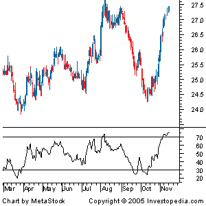 As you can see from the chart, the RSI ranges from 0 to 100. An asset is deemed to be overbought once the RSI approaches the 70 level, meaning that it may be getting overvalued and is a good candidate for a pullback. Likewise, if the RSI approaches 30, it is an indication that the asset may be getting oversold and therefore likely to become undervalued. |
|
Investopedia explains 'Relative Strength Index - RSI'
A trader using RSI should be aware that large surges and drops in the
price of an asset will affect the RSI by creating false buy or sell
signals. The RSI is best used as a valuable complement to other
stock-picking tools.
Let's go two steps further with the RSI indicator by reading An Introduction To The Relative Strength Index and Relative Strength Index And Its Failure-Swing Points. Source: Investopedia |
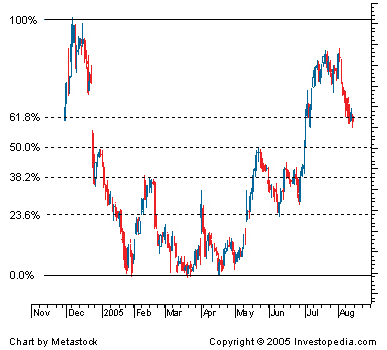
Fibonacci Retracement
Definition of 'Fibonacci Retracement'
A term used in technical analysis that refers to areas of
support (price stops going lower) or resistance (price stops going
higher). The Fibonacci retracement is the potential retracement of a
financial asset's original move in price. Fibonacci retracements use
horizontal lines to indicate areas of support or resistance at the key
Fibonacci levels before it continues in the original direction. These
levels are created by drawing a trendline between two extreme points and
then dividing the vertical distance by the key Fibonacci ratios of
23.6%, 38.2%, 50%, 61.8% and 100%.
 |
|
Investopedia explains 'Fibonacci Retracement'
Fibonacci retracement is a very popular tool used by many
technical traders to help identify strategic places for transactions to
be placed, target prices or stop losses. The notion of retracement is
used in many indicators such as Tirone levels, Gartley patterns, Elliott
Wave theory and more. After a significant price movement up or down,
the new support and resistance levels are often at or near these lines.
Source: Investopedia.com |
Subscribe to:
Posts (Atom)